Overview
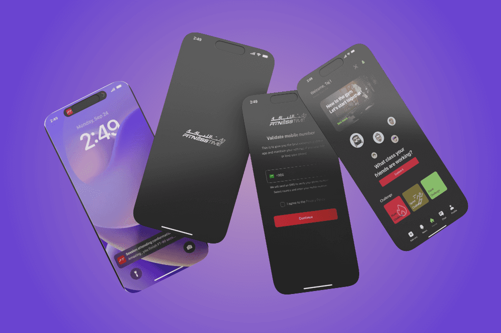
As a practice project, I reimagined the Fitness Time (FT) application to deliver a modern, user-focused experience with an outstanding UI. The redesign focused on creating a seamless and engaging platform that supports users in achieving their fitness goals, whether they’re tracking workouts, exploring training plans, or staying motivated.


Whats New
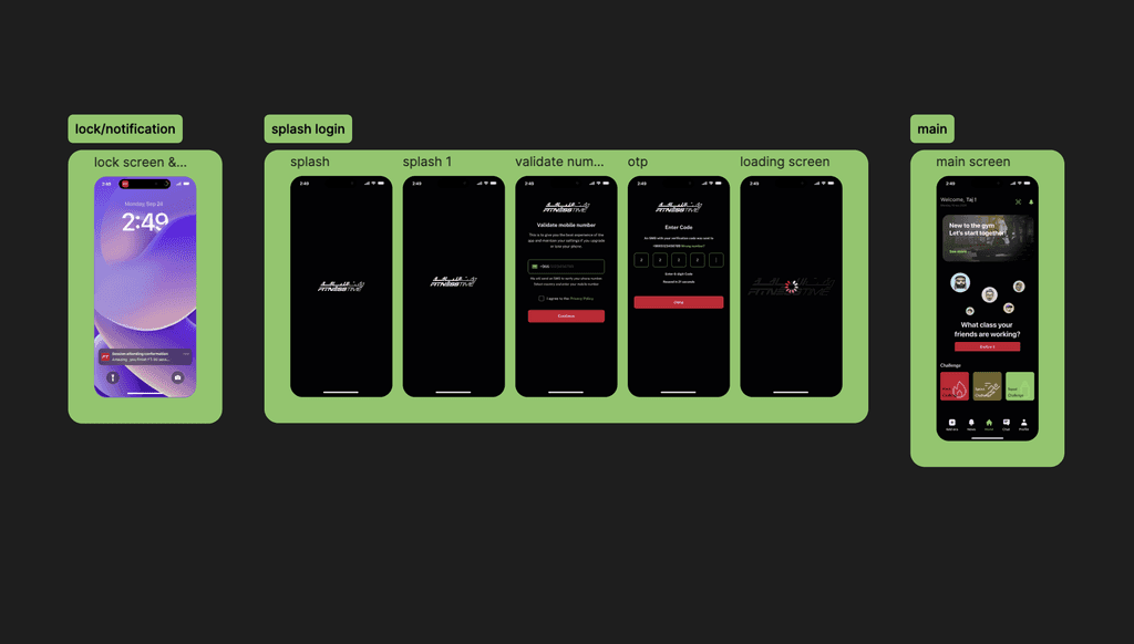
1. A Modern UX Architecture
Completely redesigned the user journey, ensuring effortless navigation through features like workout tracking, goal setting, and scheduling training sessions.
Developed a clean and intuitive information hierarchy, enabling users to access key features quickly without feeling overwhelmed.
Focused on creating a personalized experience, allowing users to set preferences, monitor progress, and receive tailored workout recommendations.
2. Outstanding UI Design
Designed a visually dynamic interface using bold typography, high-contrast colors, and sleek layouts to align with the active, energetic vibe of a fitness brand.
Key screens include:
Dashboard: A personalized overview of daily goals, workout summaries, and progress stats.
Workout Library: A curated collection of exercises and training programs, categorized for easy browsing.
Progress Tracker: Interactive graphs and visuals to display metrics like calories burned, time spent, and goal achievements.
Class Scheduler: A calendar-style interface for booking gym classes or personal training sessions.
3. Branding and Visual Identity
Conceptualized a modernized logo for FT to reflect the transformation and align with its active audience.
Developed a cohesive color palette of energetic tones, such as vibrant reds, cool grays, and dynamic blues, paired with sleek gradients for a polished look.
Designed consistent iconography and visual elements to maintain harmony across all screens and features.
4. Interaction Design
Introduced smooth transitions and microinteractions to create an engaging user experience, such as animated progress bars and button hover effects.
Designed reward animations for milestone achievements to keep users motivated and engaged.
Added gamification elements, such as badges and streaks, to make fitness progress more rewarding.
5. Mock Testing and Refinement
Conducted mock usability testing to identify bottlenecks in navigation and opportunities for improvement.
Iterated on design features like workout filters, goal-setting options, and class scheduling tools to enhance usability.
Outcome and Learnings
Revamped UX Flow: The redesign resulted in a modern and user-friendly structure that balances functionality with aesthetic appeal.
Enhanced Motivation: By incorporating gamification and engaging visuals, the app motivates users to stay active and committed to their fitness journeys.
Creative Growth: This project allowed me to sharpen my skills in UI/UX design, focusing on balancing user needs with brand identity.
Attention to Detail: From typography to animations, I paid close attention to detail, showcasing my ability to create high-quality, user-centric designs.
Fitness Time (FT) is a testament to my ability to completely transform a product with modern design principles and innovative thinking. Though a practice project, it reflects my passion for creating engaging and impactful digital experiences.